Create a ggplot of the records' count trend.
Arguments
- result
Output from summariseRecordCount().
- facet
Columns to face by. Formula format can be provided. See possible columns to face by with:
visOmopResults::tidyColumns().- colour
Columns to colour by. See possible columns to colour by with:
visOmopResults::tidyColumns().
Examples
# \donttest{
# Connect to a mock dabatase
cdm <- mockOmopSketch()
# Run summarise clinical tables
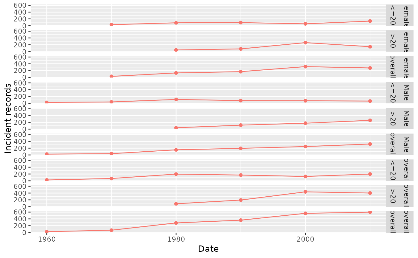
summarisedResult <- summariseRecordCount(cdm = cdm,
omopTableName = "condition_occurrence",
unit = "year",
unitInterval = 10,
ageGroup = list("<=20" = c(0,20), ">20" = c(21, Inf)),
sex = TRUE)
plotRecordCount(summarisedResult, facet = sex + age_group ~ .)
 PatientProfiles::mockDisconnect(cdm = cdm)
# }
PatientProfiles::mockDisconnect(cdm = cdm)
# }